Making Content More Visual
On average, over 2.5 quintillion bytes of data are created every single day. I’m no mathematician, but I can confidently say that’s A LOT of data. So how do you stand out among the 2.5 quintillions? An easy place to start would be making your content more visual with the use of infographics.
In its simplest form, an infographic can be defined as a visual image such as a chart or diagram used to represent information or data.
Thanks to social media, our audiences have been trained to retrain small bites of information rather than full-length content. The key is to grab their attention quickly and deliver your message with as little amount of words as possible.
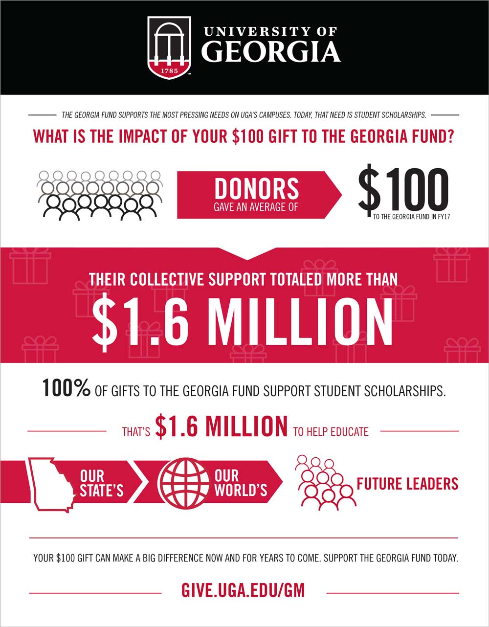
I could throw statistics out all day, but one of the best ways to learn is by example. Below I will walk you through the process of turning a paragraph full of rich numeric driven information into a visually pleasing piece that is easier for a reader to digest.
This was the copy provided:
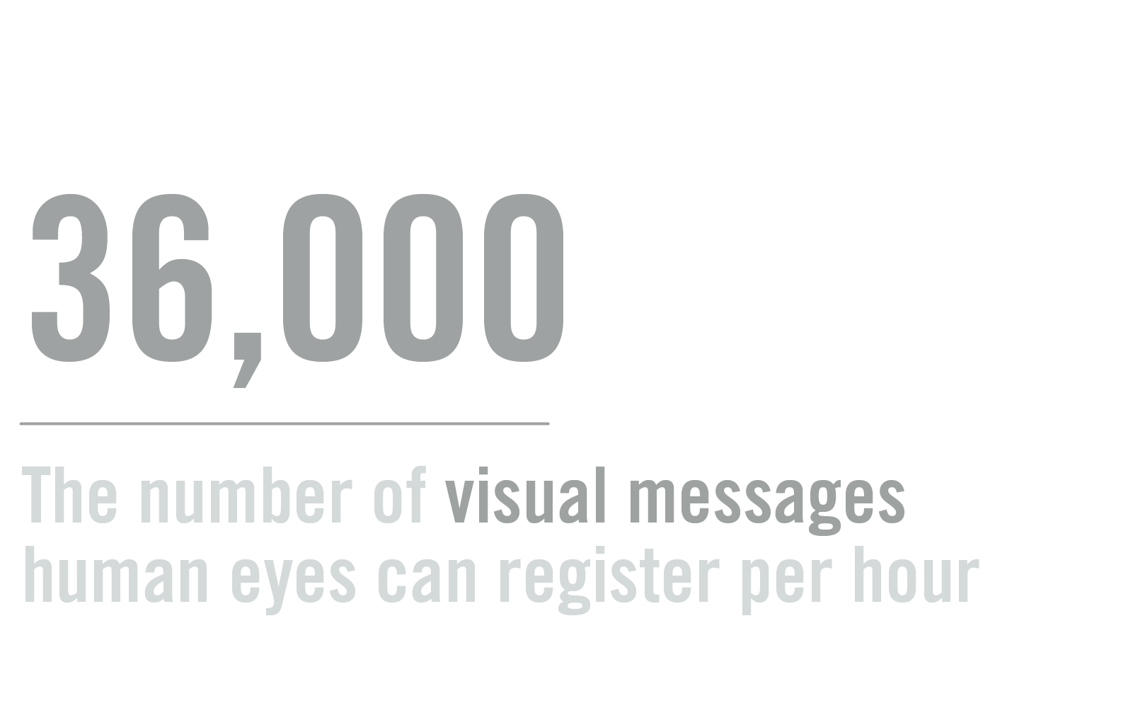
What is the impact of a $100 gift to the Georgia Fund? Last fiscal year, over 36,000 donors collectively gave more than $1.6 million to the Georgia Fund. The average gift size? $100. Today, 100% of gifts to the Georgia Fund support student scholarships. That’s $1.6 million to help educate our state’s – and our world’s – future leaders. A $100 gift can make a big difference now and for years to come.
Support the Georgia Fund today.
give.uga.edu/gm
I knew that the numbers would be the most impactful information for the audience to see, so I treated each one as its own collection and found icons to correlate with the message.
This is how I broke it down:
- What is the impact of a $100 gift to the Georgia Fund?
- The average gift size? $100.
- Today, 100% of gifts to the Georgia Fund support student scholarships.
- That’s $1.6 million to help educate our state’s – and our world’s – future leaders.
- A $100 gift can make a big difference now and for years to come.
Next time you need to create an ad, create a handout to show the impact your fund has made or when you just want to test something new for your audience keep these stats in mind!
Information used in this blog post was gathered from Data Never Sleeps.- domo.com/solution/data-never-sleeps-6, The Data Is In: Infographics Are Growing And Thriving In 2017 (And Beyond) – forbes.com/sites/cherylsnappconner/2017/10/19/the-data-is-in-infographics-are-growing-and-thriving-in-2017-and-beyond/#6673e920137c and The Visual-First Method: New ebook on how to deploy visual content across your organization – killerinfographics.com/blog/visual-first-method-ebook.html.


