Establishing Visual Hierarchy
Everything is a bit different these days, and we’re all finding ways to navigate a world that includes significantly more digital communication than before. Consider these principles of visual hierarchy before sending your next fundraising email so you can guarantee donors are seeing the most important information first!
What is visual hierarchy?
Visual hierarchy is a method of organizing content in order of importance and influences the way users absorb it — basically, how we process information on a page.
Size and scale
The larger a font or element is on a page, the more attention it will attract. But, be careful not to make everything large; otherwise, nothing will attract attention, and it will be too overwhelming to the viewer.
Color and contrast
Bright colors are more likely to attract attention.
Note: Black copy should never be written over red background and vice versa. Review the UGA Brand website’s section on Accessibility for more information.
Alignment
An element that is separated from the alignment of other objects or text will attract more attention. However, don’t immediately choose to center text that you want to highlight as centering too many elements can become distracting.
Repetition
When styles repeat, it gives readers the impression that the content is unified, boosting understanding and recognition.
Negative space
Whitespace, or negative space, around elements will allow your work to breathe, and it makes the information easier to digest, allowing users to absorb individual bits of information more easily.
Texture and style
Textures attract attention, but its style can also conflict with the important content. Be conscious and consistent with the overall arrangement of space, text and other details (photography, patterns, headlines, text with underlines, etc.) on your page.
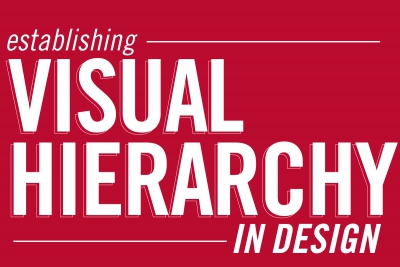
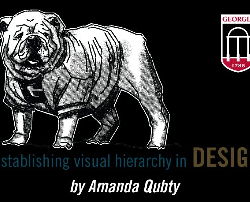
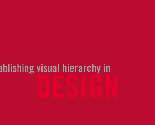
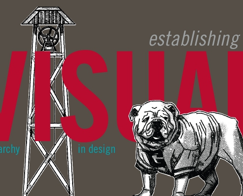
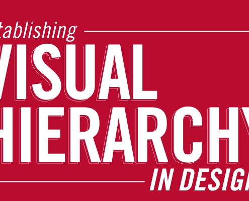
Here are three alternative header images for this article, plus the one I chose to use. (Click on the thumbnail to view the entire image.) After reviewing the principles described above, can you spot the concerns with the other three options and why I chose to use the one I did?
For more detailed information and additional principles to consider, check out these articles and videos.
12 Visual Hierarchy Principles Every Non-Designer Needs to Know

 Amanda Qubty


 Edwin Hammond
 created by Amanda Qubty

 Tumisu from Pixabay
 created with free stock photo from pexels.com