Using your brand to tell your story

A little over five years ago, UGA underwent a brand restructure. The idea was to create a distinctive look, feel, and voice—one that people will immediately recognize as the University of Georgia. As designers, having clear and defined guidelines helps us stay true to the brand.
A common inquiry that we get from our different units is, “How do we stand out from the overall UGA brand?” It’s not that units want to be outside of brand guidelines; it is more that they want to find their own identity within the brand. They want their specific audience to see their marketing materials and know that, not only are they part of UGA, but they are specifically UGA Alumni Chapters, UGA Parent Giving, UGA Student Alumni Council, and the list goes on…
To help our units find their own distinctiveness and brand their materials, we have created style guides that give an overview of the unit’s audience, goals, key messaging, personality and visual identity. A style guide aids DARCOMM when creating messaging and promotional materials, and also provides the unit with a starting place to help them create their own materials by suggesting headlines, key messaging points and giving them a visual guide. The more connected and concise your materials look and the language feels, the clearer and stronger your message will come across to your audience.
Two examples of effective use of the style guides are UGA Alumni Chapters and UGA Parent Giving.
UGA Alumni Chapters
Alumni Chapters’ audience includes young alumni, current students, and established alumni. Their key message is, “Whatever your next chapter, your Bulldog family will be there.” See the style guide.
It was our job to create a voice, within the UGA brand, that shows UGA spirit, connection among the Bulldog Nation, and the support that offered when you are part of the Bulldog family. We accomplished this with headlines such as “Bulldogs never bark alone,” “Our commitment doesn’t end after Athens,” and “As one chapter ends, a new one begins.”
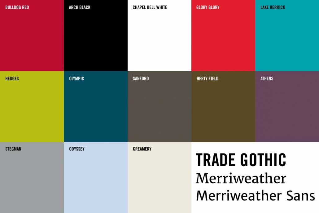
Visually, we focus on traditional colors such as Bulldog Red and Arch Black to give the sense of tradition, but we also bring in secondary colors such as Glory Glory and Olympic to give off energy that matches the younger audience. The addition of a script font as a graphic element creates a feeling of a warm personal touch. Check out the examples below.


UGA Parent Giving
Parent Giving’s audience are parents of UGA students and current Parents Leadership Council members. Their core message is “Join a philanthropic community that helps you stay connected to your student while making a difference for others.” See the style guide.
It was our job to create a voice, within UGA brand, that shows families engaging with the University, other families, their student(s) on campus and making an impact on campus. We accomplished this with headlines such as “Ensuring a world-class learning experience,” “Committed to removing barriers and opening doors,” and “Helping students thrive. That’s our commitment.”
Visually, we focus on traditional colors such as Bulldog Red and Arch Black to establish the sense of commitment to the university. Then, we bring in colors from our neutral color pallet, Sanford, Creamery and Odyssey, to help the brand feel warm and inviting.
A large part of the Parent Giving style relies on the photography. We want our audience to see themselves in photos of happy, smiling families on campus. See examples below.


 Amanda Qubty
 Unsplash